-

 Fully Responsivelooks and works well on any device
 -
 Based on Bootstrapto cover all the web development cases
 -
 Enjoy Electronicthe Responsive HTML Template
 -
 Awesome Designclean, well-balanced and flexible
 -
 Download nowand get the lifetime updates
12654
Photos added
65
Places visited
9356
Posts written
Identity
Cras pharetra suscipit tempus.
Morbi egestas velit quis suscipit
- Logotype Design
- Naming
- BrandBooks
Web Development
Cras pharetra suscipit tempus.
Morbi egestas velit quis suscipit
- Web Design
- Programming
- Databases
Ui / UX Design
Cras pharetra suscipit tempus.
Morbi egestas velit quis suscipit
- Prorotypes
- Wireframes
- Iteractions
Video Effects
Cras pharetra suscipit tempus.
Morbi egestas velit quis suscipit
- Video actions
- Naming
- BrandBooks
Have some Questions about our Services?


Overview
The Electronic Responsive HTML Template is the complete creative solution for building a website. This Template is based on the latest Bootstrap framework and covers all possible web site development cases.
The general advantages are: modern, clean and well-balanced design, outstanding flexibility, a lot of content variations and ease of use.
Electronic Responsive HTML Template is fully responsive, looks and works perfect on any device.
Some people say i am a new romantic, but a am just Electronic!
Pay once and get the lifetime updates!
The downloadable archive includes the Templatee Documentation and set of the .PSD files of key template pages.
The latest Bootstrap 3 allows you to implement the new UI elements easily and without any problems.
Electronic HTML Template
Multipurpose template
15
2014 Jun, 14
Ideal for Personal Blog, Corporate website and Creative portfolio. Modern Design helps you to achieve the goal of your business. Create the website of your dream!
Responsive and Retina
23
2014 Jun, 14
The Electronic Creative Template comes with 10 pre-defined color themes. You can simply attach desirable color scheme by renaming the CSS file call on the top of page code.
Multiple Columns


Responsive Web Design
Recently, an emergent discipline called “responsive architecture” has begun asking how physical spaces can respond to the presence of people passing through them.
Screen Resolution
With more devices come varying screen resolutions, definitions and orientations. New devices with new screen sizes are being developed every day, and each of these devices may be able to handle variations in size, functionality and even color.
Flexible Images
One major problem that needs to be solved with responsive Web design is working with images. There are a number of techniques to resize images proportionately, and many are easily done.
Custom Layout Structure
For extreme size changes, we may want to change the layout altogether, either through a separate style sheet or, more efficiently, through a CSS media query.
Showing or Hiding Content
It is possible to shrink things proportionally and rearrange elements as necessary to make everything fit (reasonably well) as a screen gets smaller.
A Responsive Showcase
Below we have a few examples of responsive Web design in practice today. For many of these websites, there is more variation.

Abigail Quinn
Business Analytics Specialist
Good Job!
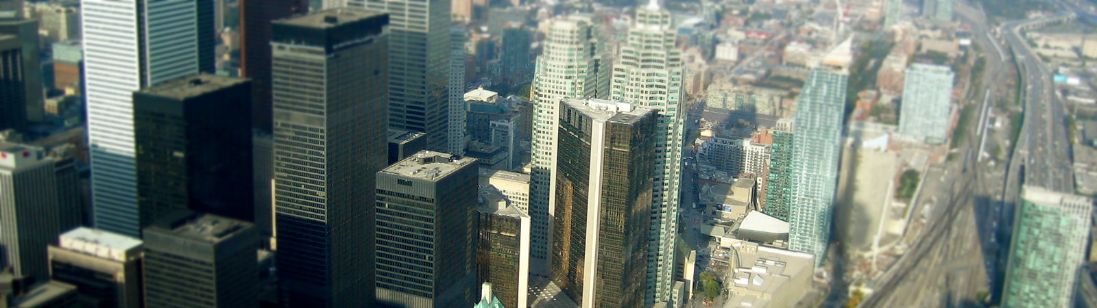
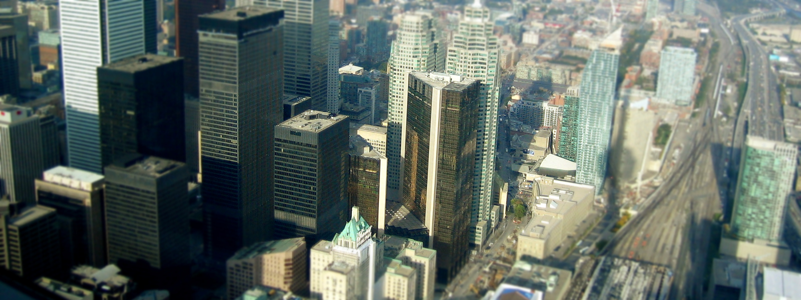
During the spring and summer of 1977, Toronto's city and metro councils were under pressure to do something about the sex trade and sex shops that were housed in the area along Yonge street from Queen to Bloor streets following the death of the twelve-year-old shoe-shine boy, Emanuel Jaques. The crisis was more political than real; nevertheless, under pressure from Toronto mayor David Crombie, Ackroyd had to plan and implement a neighbourhood sweep on the scale of the 1968 Yorkville sweep.

Brands
Donec eleifend
Cras pharetra suscipit tempus. Morbi egestas velit quis suscipit consectetur. Donec augue mauris, eleifend ut elit non, lobortis vulputate elit.
Morbi feugiat
Etiam hendrerit, est eu tincidunt auctor, turpis sapien luctus magna, sagittis adipiscing diam neque sed orci. Ut sed eleifend tortor.
Aliquam ultrices
Cras pharetra suscipit tempus. Morbi egestas velit quis suscipit consectetur. Donec augue mauris, eleifend ut elit non, lobortis vulputate elit.
Vestibulum phare
Etiam hendrerit, est eu tincidunt auctor, turpis sapien luctus magna, sagittis adipiscing diam neque sed orci. Ut sed eleifend tortor.
Articles

In 1965, 7-Eleven bought some of the machines and services
French Land Register data, which excludes lakes, ponds, glaciers > 1 km² (0.386 sq mi or 247 acres) and river estuaries. Lavaudieu is a commune in the Haute-Loire department in south-central France. Buildings include the Romanesque Lavaudieu Abbey, otherwise Lavaudieu Priory (Abbaye Saint-André de Lavaudieu), built by St Robert, the first abbot of La Chaise-Dieu, in the 11th century, which was at first a Benedictine priory, and later a house of secular canonesses from the Auvergnat nobility.
Learn More
The Room Dedication Program has recently been implemented
The Thayer Hotel is a 151-room "Historic Hotel of America" property located 50 miles north of New York City on the banks of the Hudson River at 674 Thayer Road in West Point, New York on the campus of the United States Military Academy. It is named after Sylvanus Thayer, West Point class of 1808, the "father of the Military Academy." The Thayer Hotel has three main markets: tourists visiting West Point, weddings, and corporate conferences.
Learn More
2014 Jun, 14
Bootstrap Responsive Grid System
The system utilised prefabricated light gauge steel frames which could be built economically up to a maximum of 4 storeys.

2014 Jun, 14
Isotope filtered Masonry Portfolio
(December 22, 1886 – July 23, 1947), was a Welsh philosopher and academic. He should not be confused with David James Jones (Gwenallt), a contemporary writer.

2014 Jun, 14
Superfish Dropdown Menu
The system utilised prefabricated light gauge steel frames which could be built economically up to a maximum of 4 storeys.
2014 Jun, 14
Parallax Backgrounds
(December 22, 1886 – July 23, 1947), was a Welsh philosopher and academic. He should not be confused with David James Jones (Gwenallt), a contemporary writer.
2014 Jun, 14
100% Bootstrap Compatible
The system utilised prefabricated light gauge steel frames which could be built economically up to a maximum of 4 storeys.

2014 Jun, 14
Full set of the PSD Files
The system utilised prefabricated light gauge steel frames which could be built economically up to a maximum of 4 storeys.


